Tutorial
De-confounding the effect of microbial load in disease association analysis
This is an example R code that show how to use predicted microbial loads to adjust their effects in the disease association analysis. As an example, microbiome data from Crohn’s disease and control samples obtained from Franzosa EA et al., 2018 are analyzed below. These data are available here.
To start the analysis, species-level taxonomic profiles, their metadata (i.e. disease/control), and predicted microbial loads are prepared. To remove minor species from the downstream analysis, unsupervised filtering is applied (mean abundance < 1e-4 and prevalence < 10%) and species that did not meet the thresholds were excluded.
library(tidyverse)
library(ggpubr)

## read species-level taxonomic profile of the samples (mOTUs v2.5)
d <- read.delim("data/Franzosa_2018_IBD.motus25.tsv", header = T, row.names = 1)
d <- d %>% t() %>% data.frame(check.names = F)

## modify species names and exclude unmapped fraction
colnames(d) <- colnames(d) %>% str_remove("ref_mOTU_v25_") %>% str_remove("meta_mOTU_v25_")
d <- d %>% select(-contains("-1"))

## read metadata
md <- read.delim("data/Franzosa_2018_IBD.metadata.tsv", header = T, row.names = 1)

## read microbial load data
ml <- read.delim("data/Franzosa_2018_IBD.load.tsv", header = T, row.names = 1)
md$load <- ml$load %>% log10()

## exclude minor species
keep <- apply(d, 2, mean) > 1E-4 & apply(d > 0, 2, mean) > 0.1
d <- d[, keep]

## use only control and CD samples (i.e. exclude ulcerative colitis samples)
keep <- md$Disease == "CTR" | md$Disease == "CD"
md <- md[keep, ]
d <- d[keep, ]

md$Disease <- md$Disease %>% factor(levels = c("CTR", "CD"))
Before analyzing the data, let us compare the predicted microbial loads between Crohn’s disease and control samples.
ggplot(md, aes(x = Disease, y = load, fill = Disease)) +
    theme_bw() +
    stat_compare_means() +
    geom_boxplot()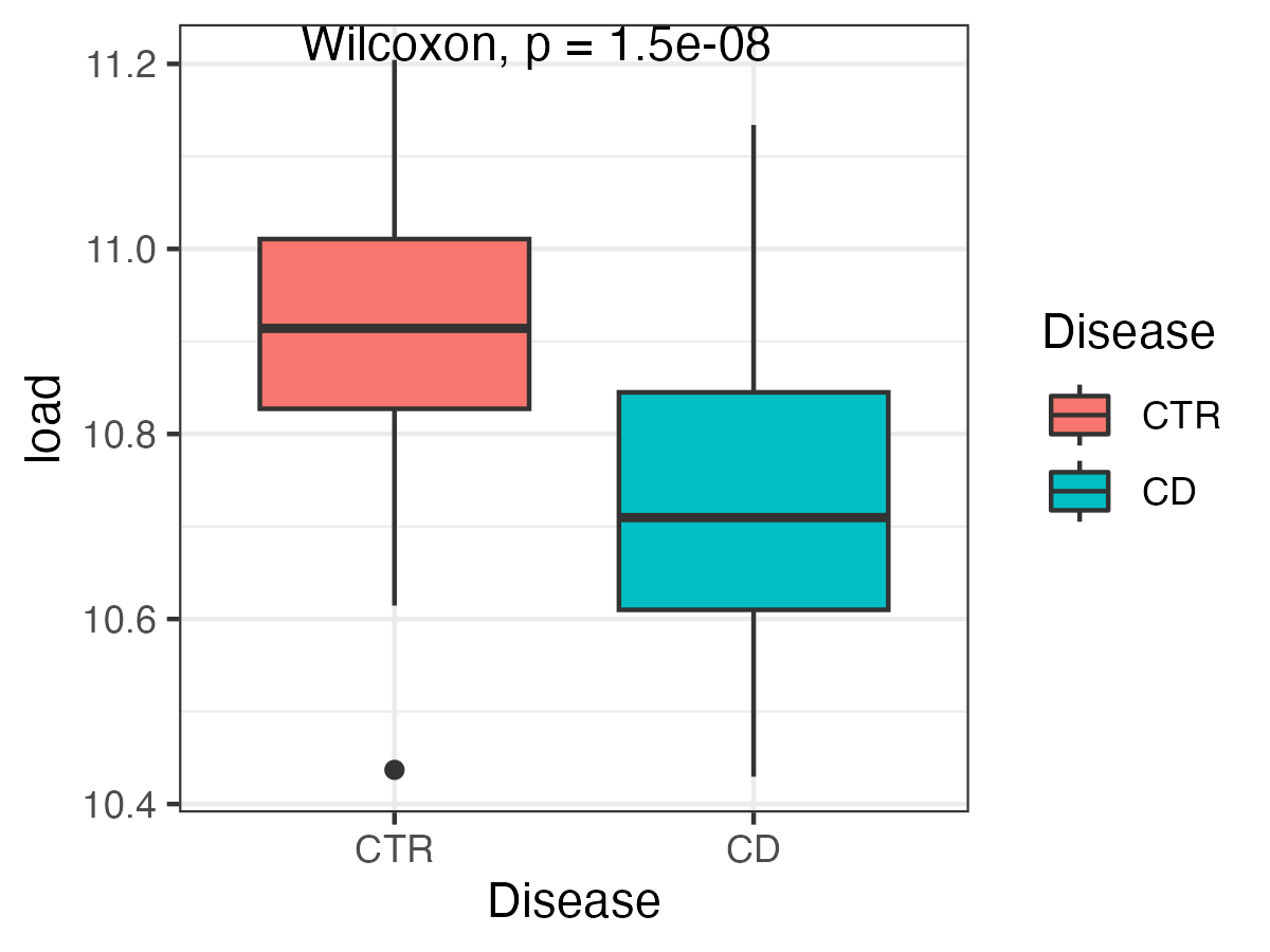
After preparing the datasets, the glm() function is used to evaluate associations between microbial species and the disease condition, and effect sizes and p-value obtained from the analysis are stored in the res1. Since species abundances often have a skewed distribution, a log10 transformation is applied to the species abundances in the analysis. Adjustments for multiple testing are performed using the p.adjust() function, and p-values are transformed to FDR.
p <- c()
e <- c()
for(i in 1:ncol(d)){
    x <- log10(d[, i] + 1E-4)
    res <- glm(x ~ md$Disease)

    p[i] <- summary(res)$coefficients[2, 4]
    e[i] <- summary(res)$coefficients[2, 1]
}
res1 <- data.frame(sp = colnames(d), e = e, p = p, fdr = p.adjust(p, method = "fdr"), method = "without adjustment")
Again, the same glm() function is applied but which incorporates predicted microbial loads as a covariate in this analysis. The results are stored in the res2.
p <- c()
e <- c()
for(i in 1:ncol(d)){
    x <- log10(d[, i] + 1E-4)
    res <- glm(x ~ md$Disease + md$load)

    p[i] <- summary(res)$coefficients[2, 4]
    e[i] <- summary(res)$coefficients[2, 1]
}
res2 <- data.frame(sp = colnames(d), e = e, p = p, fdr = p.adjust(p, method = "fdr"), method = "with adjustment")
After obtaining the results with and without adjustment, let us compare the FDR of each species between the two methods. In the plot below, species significantly associated with Crohn’s disease (FDR < 0.01) are extracted and compared. The majority of these species decreased in statistical significance, and some of them lost significant associations (FDR > 0.01).
## combine results
    df <- rbind(res1, res2)

    ## include only significant species (FDR<0.01) without adjustment
    sp.list <- df %>% filter(method == "without adjustment") %>% filter(fdr < 0.01) %>% select(sp)
    keep <- df$sp %in% sp.list$sp
    df <- df[keep, ]

    ## exclude unclassified species from visualization
    keep <- !df$sp %>% str_detect("incertae sedis|sp\\.")
    df <- df[keep, ]

    ## plot
    ggplot(df, aes(x = reorder(sp, fdr, min), y = -log10(fdr), col = method)) +
      theme_bw() +
      geom_point() +
      geom_line(aes(group = sp), col = "gray", arrow = arrow(length = unit(0.15, "cm"))) +
      geom_hline(yintercept = -log10(0.01), col = "red", linetype = 2) +
      theme(axis.text.x = element_text(angle = 90, hjust = 1, vjust = 0.5))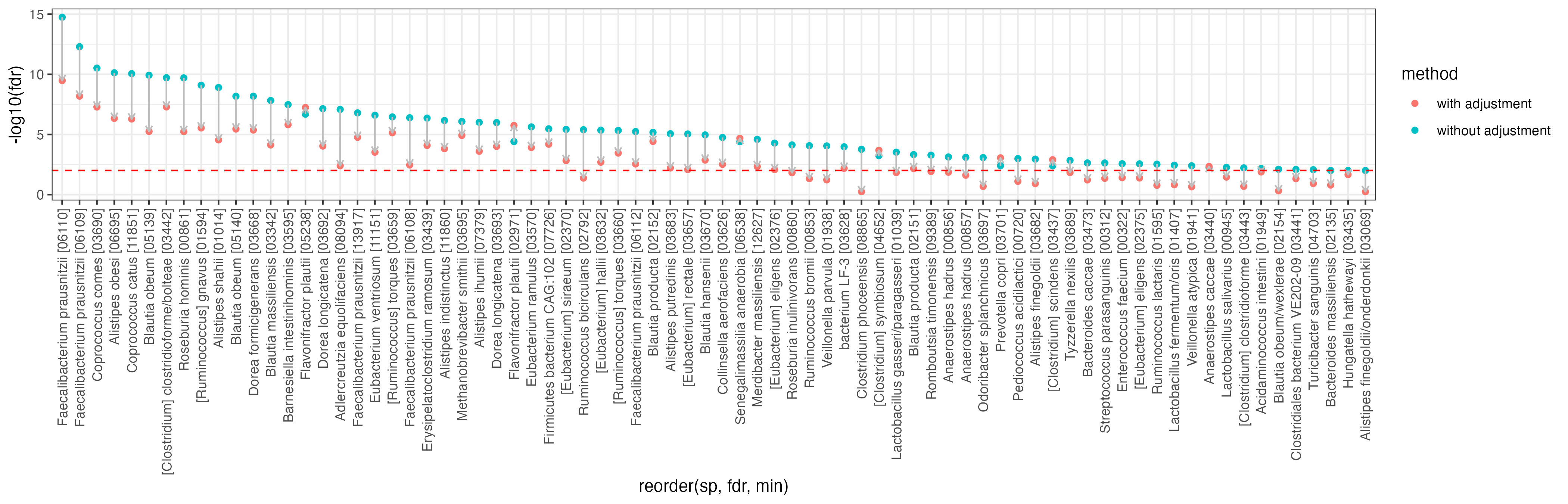
Choice of species profilers
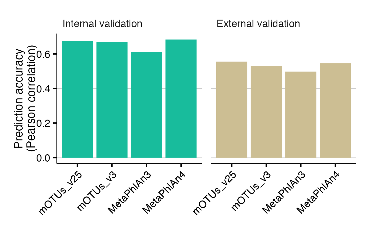
The different species profilers (e.g. mOTUs and MetaPhlAn) show almost the same prediction accuracy, except for a slightly lower prediction accuracy using MetaPhlAn3.